Who thinks network graphs look amazing? I do. I recently stumbled upon NetworkX and Gephi while looking for new ways to visualize item similarity. I spun up Kaggle and found the TED talks dataset. With some coding and reviewing network graphs, I present to you, The Real Dyl’s TED Talks Network!
For the uninitiated, TED talks are 10-20 minute talks on various topics in front of a live audience. Topics can range from geopolitics, design, technology and even philosophy. How TED speakers talk has become an inspiration for many, including me.
The TED talks dataset contains the title and a short description of the talk, among other things. I’ve ran scikit-learn to combine and vectorize the texts. After a bit of experimentation, I’ve settled on using latent semantic analysis (TruncatedSVD in scikit-learn) and t-sne to embed each talk into a 2D plane. I then computed the pairwise cosine distance of each talk against all other talks. Lastly I used NetworkX for the network graph part. For each talk, I’ve connected the closest 5 talks weighted by their similarity — the inverse of the distance plus some epsilon to prevent infinity.
Now I realize that’s a bit hand wavy. No matter, the goal of this blog post is to enjoy Gephi. Gephi is an open-sourced software that enables interactive visualizations of network graphs. It’s very easy to use once you get past the vocabulary and the basic user interface. My wordpress account doesn’t currently net me a Javascript engine, so I’ve just compiled a set of interesting images for analysis.
Here’s the entire TED talks graph.
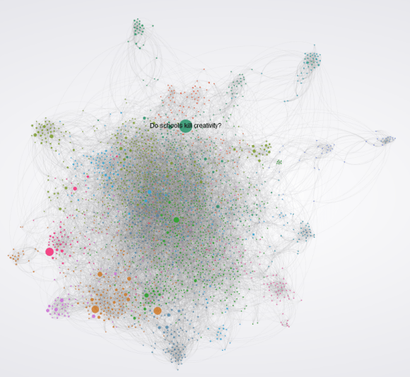
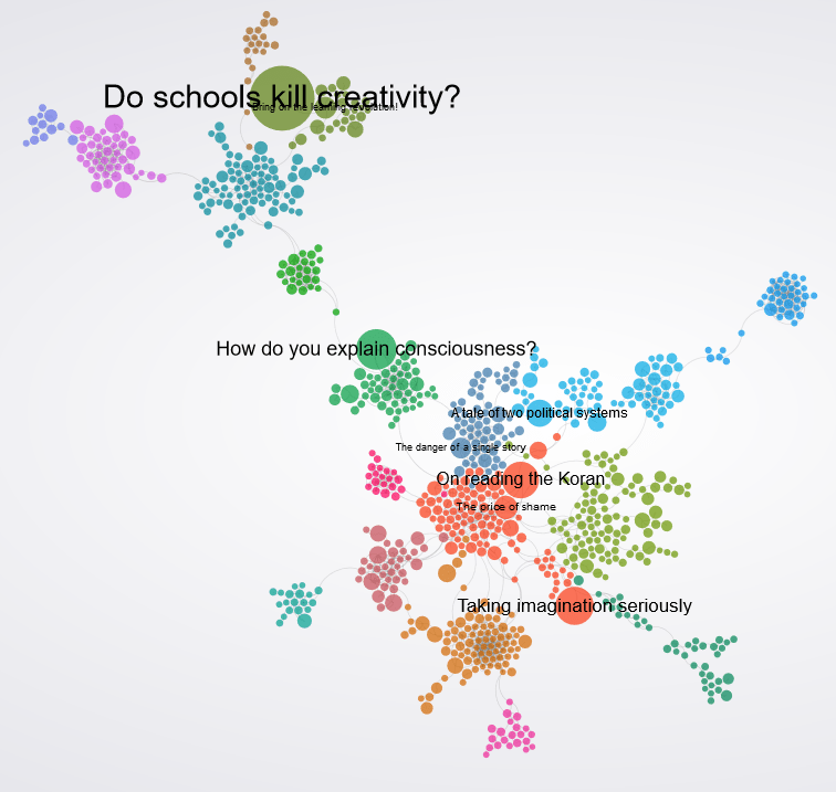
Each circle (node) is a talk and the lines (edges) are connections to the closest talks. The largest nodes are the ones that received the most comments. Ken Robinson’s provocative presentation on education, Do Schools Kill Creativity is front-page material in this graph. Right off the gate, you can also see distinct communities in the layout, formed by the Force Atlas 2 algorithm, which is a kind of algorithm that pushes out coherent groups of nodes from others. I’ve also ran the Louvain community detection algorithm (out-of-the-box in Gephi) and colored each community so the entire thing is prettier. Or is it?
What about this center hairball?

Turns out, these are the talks that do not form distinct communities and became this indistinct spaghetti bowl. It’s either their descriptions were not distinct enough to form their own communities, or that their texts are simply too sparse. A tale of two political systems, a thought-provoking piece challenging the Western model of capitalist democracies, may be too common with others that it became part of the center.
Let’s explore the suburbs.
Over at the far north are talks about ocean, with its close relative, the climate. You can see the talk that bridges the two communities, How Human Noise Affects Ocean Habitats. It specifically talks about climate change and the ocean biome.
There are other interesting neighborhoods like the internet hub, the music emporium, the design market, the robot depot and the brain bucket.
Can we make things cleaner?
Indeed we can! In this network, I’ve retained only the edges with the strongest of connections. Nodes without strong edges are removed.

You can see that the community detection algorithm makes a lot more sense now. There’s still a center mass, but it’s a lot sparser now, making it easier to analyze. See that the Wide Ocean is still as tight as ever. Also, the Universe and Beyond seems ‘close’ to the Ocean since there exists several talks that bridge the two (see the small town between the Universe-Ocean highway).
Final Thoughts – Making sense of the center
The center here is less dense so we can have a shot of interpretation. Here goes.

So the left red ones are talks such as On Reading the Koran, The Price of Shame, Why you will fail to have a good career and Looks aren’t everything, Believe me I’m a model. They seem to be a bit on the heavy side. On closer inspection of the synopsis of the talks, I find them to have some controversial thesis, ideas that breaks common biases and topics or topics that present some harrowing experiences.
On the right, we have The Happy Secret to Better Work, Every Kid Needs a Champion, and Want to be Happy? Be Grateful. They seem to be the inspirational talks. These are the talks we need when we’re in a creative slump or life crises. They tell us to feel better about ourselves and to look to the future for hope.
The center left and center right seems to be very close because the experiences that break our biases are often the experiences that gives us a newer and more insightful outlook in life. The motivational pieces pushes us out from dark places. The dark calls for the light. In page rank terms, the two concepts are a few hops away. Whether by shortest path or the worst possible path, our random walker jumps from the light and the dark side in a cycle that is life.
Thanks for reading!
