Mobility is one of the greatest freedoms achieved in the 20th century. Since then, we achieved free movement in and out of cities. Imagine how it was back then, with trains, buses and even personal locomotives replacing what was then days of foot-travel, horse-drawn carriages or sluggish ship tours. In an enormously reduced amount of travel time, we can visit friends and relatives, chase a promo on a remote part of the metro, or simply bask in an amazing view of a beach. How things have turned backwards now that we are in quarantine for personal and collective safety. Deep-rooted as it is, free movement is something easy to forget. As a data scientist, this article is about how data reflects our shared quarantine experience.
The Data – Prelude
Since May, Google has been releasing anonymized mobility reports which has been aggregated from our mobile phones. The fields are visits to groceries, parks (includes beaches and gardens), retail, workplaces and transit stations. There is also data around the length of time stayed in residences. The raw values of these are not disclosed. The first five weeks of the year is marked as the baseline, and all subsequent days are compared to their respective week days. For example, the Saturday of June 27 is compared with the first five Saturdays of the year. That deviation is what is found in the data. The data is further divided into countries. For some, there may regions and provinces.
Global Summary
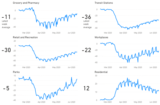
It’s important to remember that these values are changes from the baseline, so there is always the regional context to consider. Nonetheless, it can be helpful to see the global trend. The global picture reveals a very slow return back to the baseline weeks’ behaviors since April. Note that 0 is the baseline value and that for all five outdoor locations, the values are negative. This means a large decrease in visits compared to the baseline. For the residential values, it means an increase in hours spent indoors.
Global Daily Deviation Values
We can also look at the June 2020 averages to gauge the overall difference from the baseline for each major region in the world.
Interesting data points
- Latin America (Mexico, Central America & South America) features the largest decrease in outdoor visits, followed by South Asia then the Middle East.
- Europe and North America increased its visits in parks as compared to January.
- Australia, Oceania and New Zealand has started coming back to workplaces. This is a far cry from the rest of the world.
Regional Averages for June

North America and Europe
The increased visits in parks in North America and Europe is probably because of the winter season where people are indoors. For the US, the mass demonstrations are probably also a defining factor.
North America Daily Deviation Values
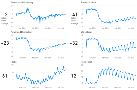
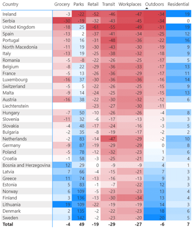
For Europe, we can find that the Nordic countries (Sweden, Denmark, Norway, Finland) have more than doubled their visits in parks because of the end of frigid winter temperatures in January. This trend can be seen on other countries to a lesser degree. The UK, features decreased visits on all outdoor locations save for parks. The same is true for Italy and Spain, epicenters of the pandemic in Europe. The Netherlands, which uses a very dense train network have decreased significantly their transit station visits.
European Averages for June
The Philippines and its neighbors
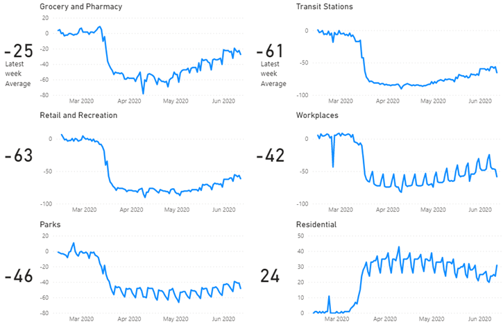
I’m Filipino so I wanted to look at how my country is doing. As you can see below, we have not been moving much. There is a imperceptibly slow movement to baseline. Declared as the world’s longest lockdown, our quarantine have made citizens spend significantly more time in their own residences. Businesses have closed and employees are either furloughed or dismissed.The majority have suffered from the effects of both the pandemic and the quarantine. Despite this, we still have a large degree of community transmission and a non-trivial testing backlog. It’s a sad picture.
Philippine Daily Deviation Values
I become somewhat more hopeful though when I look at our neighbors, which have met more success if you look at their epidemic curves. In terms of mobility, the table below shows Mongolia, Taiwan, South Korea and Vietnam as very close to their baseline outdoor visit values. These are success stories that I hope can be a model for my country.
Asian Averages for June

All these show a night and day difference from how things were last year. With free movement curtailed, it makes us think of when things will go back to normal. Sadly, I think that it will be for at least the end of the year or more. We will be going through cycles of reopening and reclosing of economies as our healthcare systems cope up with the demand. It’s not a sprint. It’s a long marathon. I am reminded of foot-travel, the only means of transportation for 99.99% of human history. Tread on. We will get there.
